Android/JetpackCompose: Component Sizing, Layout and Two Views Same Size 2 Ways
In this article, we will be taking a look at how to obtain components sizing, position, and change the layout in Jetpack Compose.
Specifically, we will be using a simple example where we have two Texts, and we are trying to have them be of the same width as the one with the larger value (Basically the Jetpack compose version of what we have done in one of my previous article SwiftUI: Two Views Same Size 2 Ways).
And again, we have 2 different approaches.
- With
onGloballyPositionedModifier - With
LayoutComposable
And obviously, there is a 3rd way where you will just simply hard code the width and height! And obviously that is not what we are interested in so we will no go through that in this article!
Set up
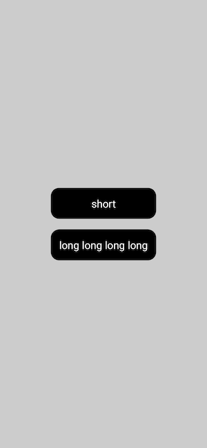
As I mentioned above, we will have two Texts, long and short, placed vertically, and we will trying to give those two the same width as that of the longer one.
@Composable
fun TwoViewSameSizeDemo() {
    Column(
        verticalArrangement = Arrangement.spacedBy(20.dp, alignment = Alignment.CenterVertically),
        horizontalAlignment = Alignment.CenterHorizontally,
        modifier = Modifier
            .fillMaxSize()
            .background(Color.LightGray)
    ) {
        Text(
            text = "short",
            fontSize = 20.sp,
            textAlign = TextAlign.Center,
            color = Color.White,
            modifier = Modifier
                .background(Color.Black, RoundedCornerShape(16.dp))
                .padding(16.dp)
        )

        Text(
            text = "long long long long",
            fontSize = 20.sp,
            textAlign = TextAlign.Center,
            color = Color.White,
            modifier = Modifier
                .background(Color.Black, RoundedCornerShape(16.dp))
                .padding(16.dp)
        )
    }
}

And obviously, each Text only taking up the space needed. And that’s why we are here!
onGloballyPositioned
This is the modifier is called with the final LayoutCoordinates of the Layout when the global position of the content may have changed. That is the If the size or position has changed part in the graph below.
I personally see this as an analogous of the GeometryReader in SwiftUI and here is how we would use it to make two views of the same width as the larger one.
Three Steps!
- Keep a
mutableStateofwidthstarting at0.dp - set the
widthto be themaxof the current width and the component widthonGloballyPositioned - Add the
.widthmodifier after the actual width is measuredonGloballyPositioned
(This is probably the only time I have appreciated Compose more than SwiftUI. We get to attach modifier conditionally easily here whereas in SwiftUI, we will have to define an entirely new struct extending ViewModifier!)
@Composable
fun TwoViewSameSizeDemo() {
    val density = LocalDensity.current

    var width by remember { mutableStateOf(0.dp) }
    var modifier = Modifier
        .background(Color.Black, RoundedCornerShape(16.dp))
        .padding(16.dp)
        .onGloballyPositioned { coordinates ->
            val coordinateWidthPx = coordinates.size.width
            val coordinateWidthDp = with(density) {coordinateWidthPx.toDp()}
            width = max(width, coordinateWidthDp)
        }

    if (width != 0.dp) {
        modifier = modifier.width(width)
    }


    Column(
        verticalArrangement = Arrangement.spacedBy(20.dp, alignment = Alignment.CenterVertically),
        horizontalAlignment = Alignment.CenterHorizontally,
        modifier = Modifier
            .fillMaxSize()
            .background(Color.LightGray)
    ) {
        Text(
            text = "short",
            fontSize = 20.sp,
            textAlign = TextAlign.Center,
            color = Color.White,
            modifier = modifier
        )

        Text(
            text = "long long long long",
            fontSize = 20.sp,
            textAlign = TextAlign.Center,
            color = Color.White,
            modifier = modifier
        )
    }
}
One thing I would like to point out here!
onGloballyPositioned returns the width in px. To convert it to dp, we will need to use the LocalDensity.current.
In addition to the size of the composable, we also have the information below included in our coordinates. Not what we are interested here though!
coordinates.positionInWindow: Position relative to the Window of the Applicationcoordinates.positionInRoot: Position relative to the Compose rootcoordinates.providedAlignmentLines: alignment lines provided to the layout. Empty for Columncoordinates.parentLayoutCoordinates: LayoutCoordinates instance corresponding to the parent of Column
Do note that the coordinates.positionInRoot is always relative to the Coordinate (0, 0), the left upper corner of the screen, ignoring any paddings or offset applied to the root composable if you are only using Composables in the layout.
Layout
onGloballyPositioned is really to use. However, as you can see, recompositions will happen for multiple times and this can become extremely expensive when the number of elements increases!
And this is where Layout shines! All higher-level layouts like Column and Row are built with this composable and it really helps us avoiding unnecessary recompositions by using intrinsic measurements!
And obviously, we have to work harder because, now, we have to measure and lay out all children manually!
Here is the basic flow of using Layout!
- Pass in the
composableswe want to lay out in content - Get a list of children that need to be measured in
measurablesand their constraints from the parent inconstraints. - constrain child views further if needed
measurethem with constraints. This will return aPlaceablelayout that has its new size. Note that aMeasurablecan only be measured once inside a layout pass.- Set the size of the parent layout
- Place children in the parent layout
Here is how we can apply it to make two view being of the same width.
@Composable
fun TwoViewSameSizeDemo() {
    val spacingDp = 20
    val density = LocalDensity.current
    val spacingPx = with(density) {spacingDp.dp.toPx().roundToInt()}

    Layout(
        modifier = Modifier
            .background(Color.LightGray)
            .fillMaxSize()
        ,
        content = {
            Text(
                text = "shorts",
                textAlign = TextAlign.Center,
                fontSize = 20.sp,
                color = Color.White,
                maxLines = 1,
                modifier = Modifier
                    .layoutId("short")
                    .background(Color.Black, RoundedCornerShape(16.dp))
                    .padding(16.dp)
            )

            Text(
                text = "long long long long",
                textAlign = TextAlign.Center,
                fontSize = 20.sp,
                color = Color.White,
                maxLines = 1,
                modifier = Modifier
                    .layoutId("long")
                    .background(Color.Black, RoundedCornerShape(16.dp))
                    .padding(16.dp)
            )

        },
        measurePolicy = { measurables, constraints ->
            val shortMeasurable = measurables.find { it.layoutId == "short" }
                ?: error("short text not found")
            val longMeasurable = measurables.find { it.layoutId == "long" }
                ?: error("long text not found")

            val (textWidth, textHeight) = calculateTextsSize(measurables, constraints)
            val placeables = listOf(
                shortMeasurable.measure(Constraints.fixed(textWidth, textHeight)),
                longMeasurable.measure(Constraints.fixed(textWidth, textHeight))
            )
            layout(
                width = textWidth ,
                height = textHeight * 2 + spacingPx,
                placementBlock = { placeTexts(spacingPx, placeables) }
            )

        }
    )
}

private fun calculateTextsSize(
    measurables: List<Measurable>,
    constraints: Constraints,
): Pair<Int, Int> {
    val textWidths = measurables.map { it.maxIntrinsicWidth(constraints.maxHeight) }
    val maxWidth = textWidths.max()
    val height = measurables.first().minIntrinsicHeight(maxWidth)
    return Pair(maxWidth, height)
}


private fun Placeable.PlacementScope.placeTexts(
    spacing: Int,
    placeables: List<Placeable>
) {
    var yPosition = 0
    placeables.forEach { placeable ->
        placeable.placeRelative(x = 0, y = yPosition)
        yPosition += placeable.height + spacing
    }
}
We first find the maxIntrinsicWidth of each measurable by using maxIntrinsicWidth(constraints.maxHeight) , we then find the max value among all measurables and set it to be the width constraint for all of them.
We have set the maxLines to be 1 so the height will be the same for all measurables and we can simply just use the minIntrinsicHeight(maxWidth) for the first.
However, if you are expecting multi-line text, for example, and want to make all the Texts of the same height as well, all you have to do is to copy and paste the width part and change the width to height!
When we place the placeables in Placeable.PlacementScope.placeTexts, since we want them to be of a Column, we keep the x to be the same and simply increment y.
Note!
Again, everything is in px when working with Layout! Therefore, if you are like be trying to make it the same look as that when using a Column Composable and define the spacing to be in dp, make sure to convert it to px using LocalDensity.
Why would Android? Google? Jetpack Compose decide to use two totally different units, px and dp for measuring and defining sizes? My guess is that px is the left over from xml era and dp is the fancy new Compose. But that is just my guess… If you know the exact answer, please leave me a comment! I would be happy to peak into Google’s mind!
Anyway, let’s give it a run! And exactly the same as what we have above!
We have used the Layout composable here because we want to measure and layout multiple composables. However, if you are only interested in the layout of one single composable, you can also use the layout modifier.
That’s all I have for today!
Thank you for reading! And listening to my complaint about Android!
Happy lay outing!

